Friday, 13 December 2013
Best image from first photo shoot
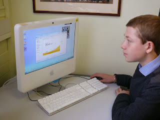
this is my image that i have choose to use as my magazines front cover, although if i take a a better image when i take more pictures in a different location i will change it.
Monday, 2 December 2013
Where i am taking my images
I am taking my pictures outside the cavern club in liverpool. i might also take some images with liverpool in the background and then choose which images i will use for my front cover, i could use the some for my double page spread also.
Friday, 29 November 2013
What angle am using
I am going to be taking my picture using a canted angle to get the cavern sign what is above billy in the picture. I will take other pictures using different angles to choose which one what will look the best on the front of my magazine. below are images what i got of google where people have used a canted angle.
When I am going to take my images
I am going to go to liverpool next tuesday with billy to take my picture outside the cavern club. I am going to take my pictures will it is going dark to get the affect, by doing this you will get a hard shadow affect.
Props I am going to use
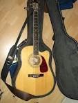
I am using a guitar in my picture to show that the genre of my magazine is classical rock, Billy is going to be wearing a leather jacket, what they use on other classical rock magazines such as MOJO.
Wednesday, 27 November 2013
my target audience and who my magazines model style is based on
the target audience i am aiming my magazine at is 16-23 who are interested in the latest artists. a style model for my magazine is Billboard who target a huge range of audiences as they appeal to a huge variety of genres. They use huge selling artists on there front covers, such as justin bieber, one direction who are all world renown.
description of image for my front cover
For my main image i am going to be taking it out side the cavern club in liverpool as it is an icon place. i am going to be using Billy Adams in my picture standing underneath the cavern club sign. the props i am going to use in my picture is Billy holding an acoustic guitar. he is going to be wearing a black leather jacket, white t-shirt and jeans. the camera angle i am going to use for this image is canted angle so i am able to get the cavern sign behind him.
Tuesday, 19 November 2013
Wednesday, 6 November 2013
Tuesday, 5 November 2013
The challenging conventions
the challenging convention what has not been put on this magazine is the barcode, as you can see billboard have not used this convention on the front as it will probably be on the back or content of the magazine.
Wednesday, 16 October 2013
content page
on my content page i have included the schools contact details. The page numbers for what the magazine includes. i used the same font as i did on my front cover as it is the house style, i also used the same colours.
Tuesday, 15 October 2013
final front cover
Ways i can improve are:
- My shot composition needs improve. using the rule of thirds and maximising the space for text(as there is room in the middle)
- I used the Apple Mac in the image as is shows the great equipment available.
- I added the writing as it stands out well to catch the eye of the Audience.
- I used brown and white because they are my chosen house colours and stand out for the Audience.
- my house colours are also used on my Contents page
Colour changes to attract Audience
- I changed the colour of my font as it didn't stand out very well for the Audience
- I used the select Text tool to re-colour using the white. it is more eye catching, attracting the attention of the audience.
- Re-sized the Font to catch the Audiences eye
Adding Conventions
I added the following conventions of a School Magazine:
- an issue number
- date.
However:
- i didnt put a price, barcode or exact date as these are usually free publications on a termly basis
Monday, 14 October 2013
Blending options
i added black round the writing to make it appeal to the audiences catching there attention. i did this by using the blending option.
Monday, 30 September 2013
photo permissions
- it enables me to take pictures of students to use as actors in my photos.
- this letter is distributed to all students by the academy to use as actors and models.
Wednesday, 25 September 2013
best draft picture
- I have chosen this picture as my best draft as it is a medium close up.
- It shows Charon working on the apple mac showing the great equipment available.
- He is smiling which shows its a good school with happy students.
- He looks smart to show students in the school are well presented.
Tuesday, 24 September 2013
Monday, 23 September 2013
Subscribe to:
Comments (Atom)


